Bluzo
BRAND IDENTITY • CREATIVE DIRECTION
The challenge
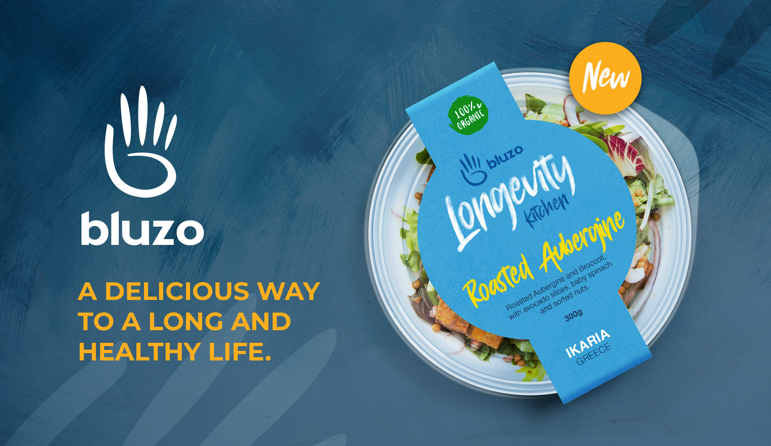
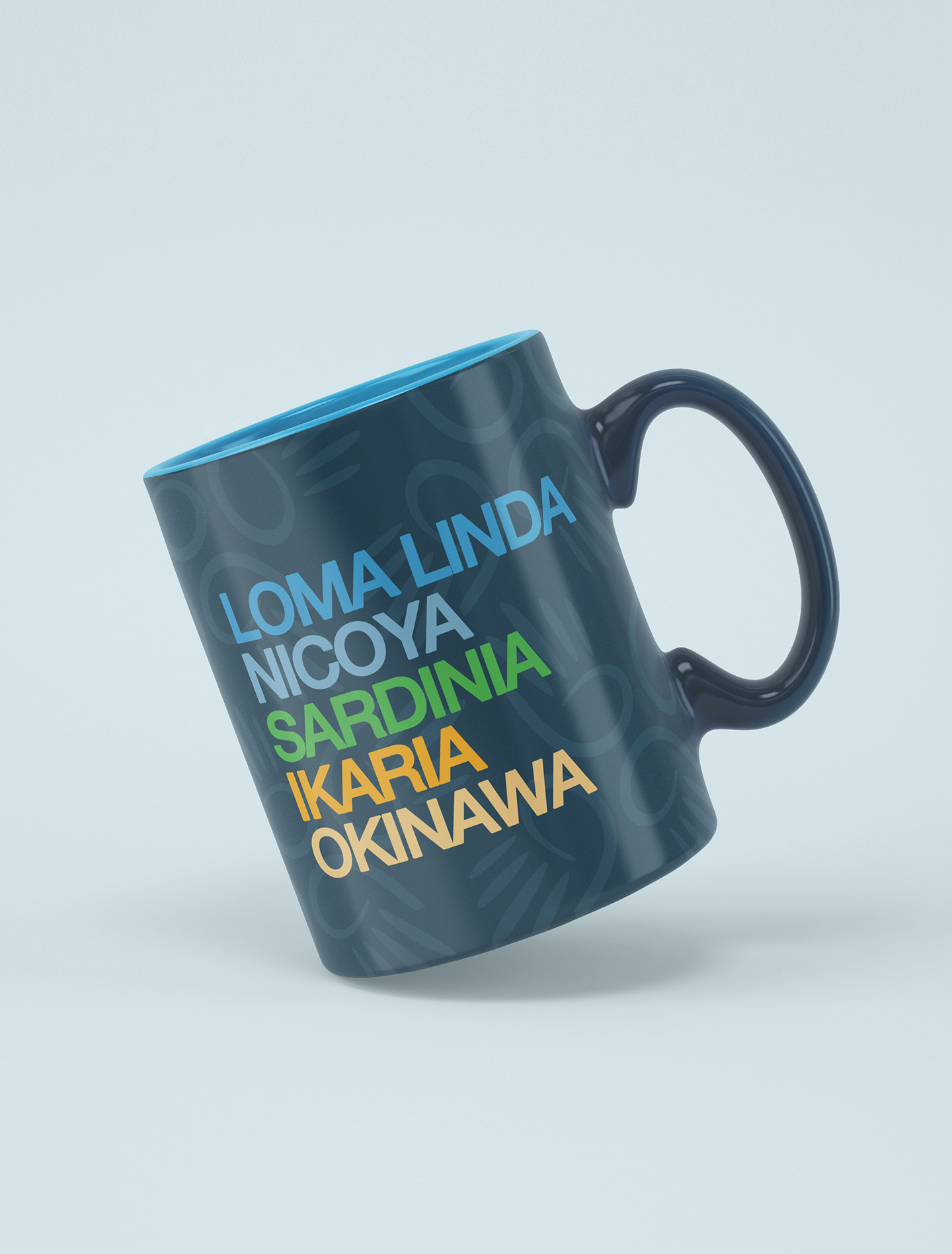
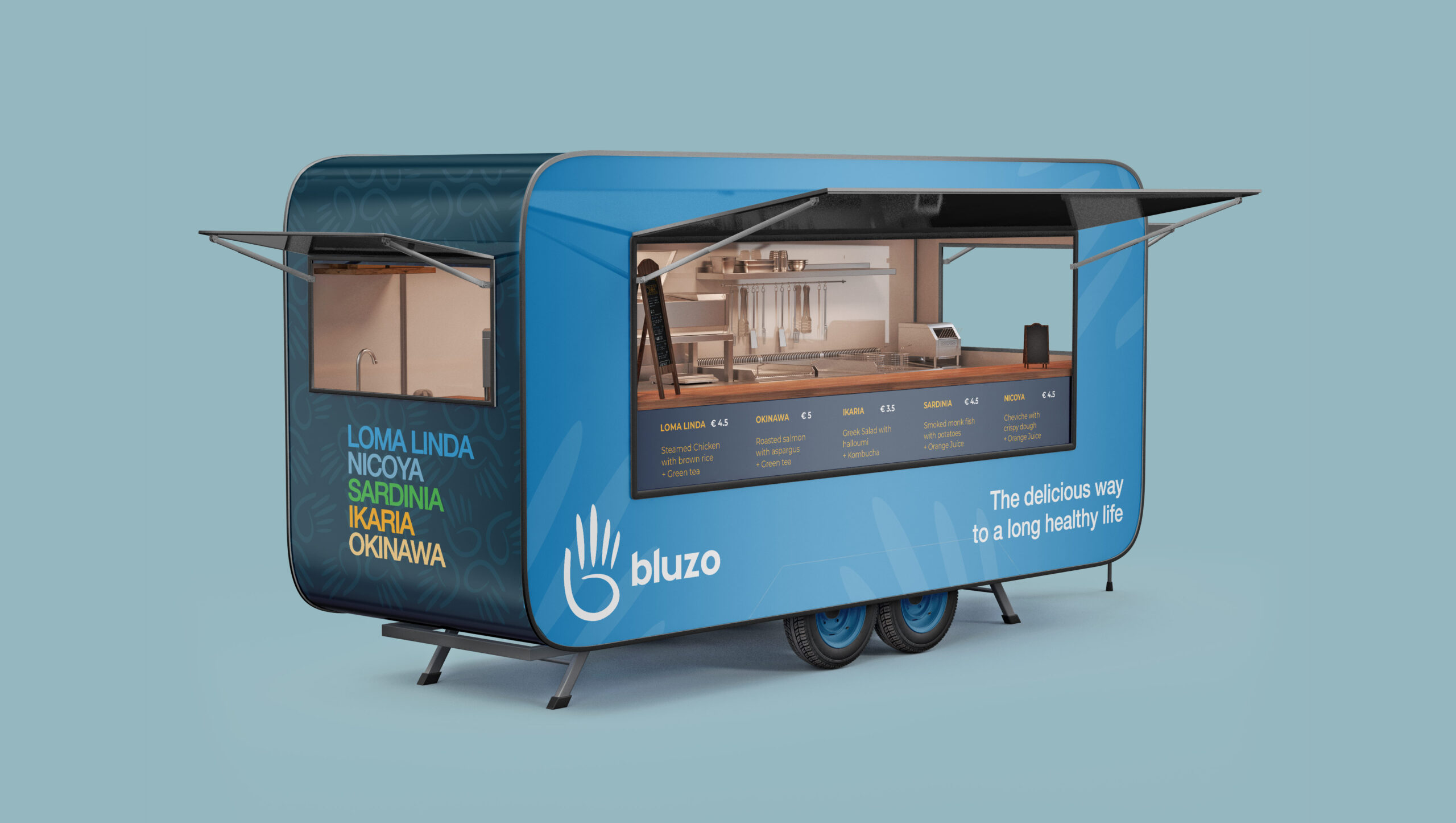
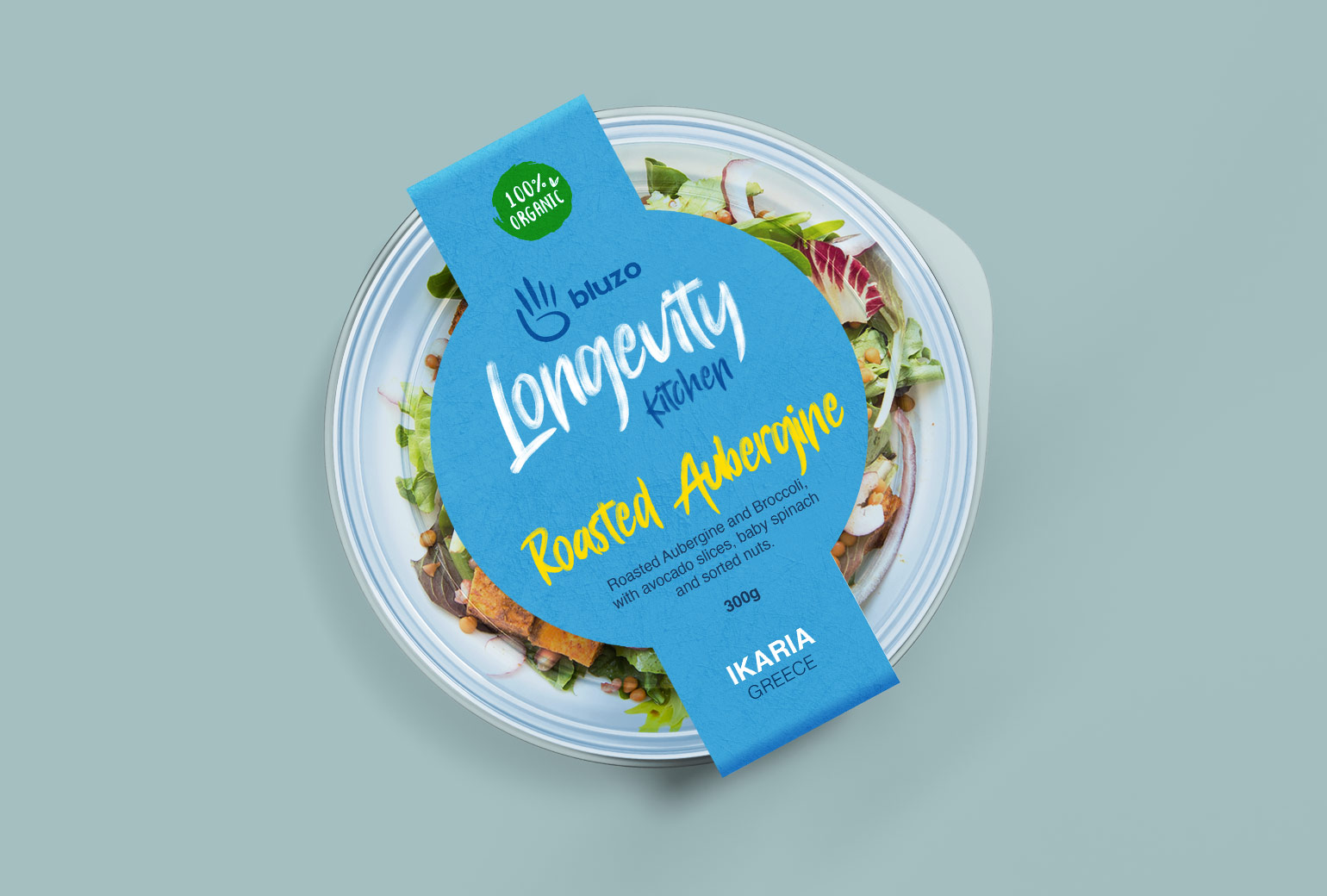
The company Bluzo, short for "Blue Zones," approached us to design a logo that reflects the essence of the world’s five regions known for longevity and healthy living. Specializing in selling eco-friendly, handcrafted foods inspired by the diets of these areas, Bluzo needed a visual identity that conveyed both health and sustainability.
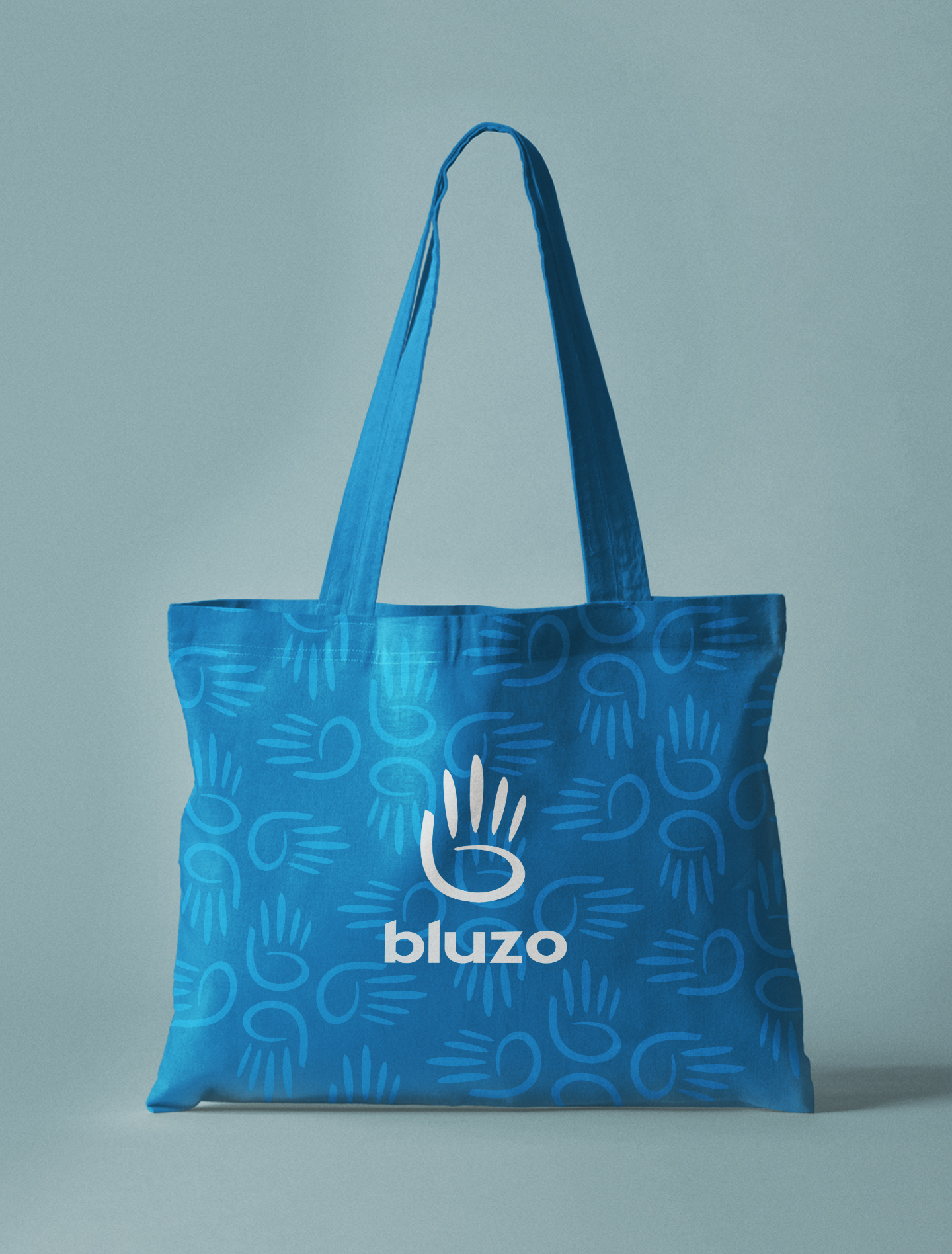
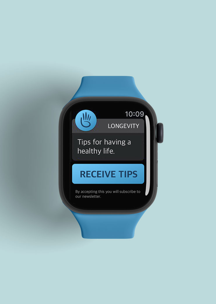
We crafted a clean, modern logo incorporating subtle elements from these five regions, while emphasizing the handcrafted concept. A calming palette of different shades of blue, green and yellow were chosen to represent wellness, longevity, and the planet.

The Icon
Main logo

Logo Pattern
7-Eleven Promotional video released inside the franchise's channels.

Are ready to take your brand to the next level?
Book a discovery call with me and let's find out how I can help. It's free.