Company / Vivino
My Role / Senior Product Designer
Design Lead Role /
Create a prototype concept to test the new Look & Feel of Vivino's new subscription service - Vivino WineClub.

Vivino is an online wine marketplace and the most downloaded wine-scanning app in the world, with 12.5 million different wines, and 51 million active users globally.
Vivino was expanding its services to a new subscription model with a personalized WineClub.
Intro
I was tasked to come up with a new concept for Vivino's WineClub key visual that would entice customers to test the service. There were two different user tests scheduled:
1. Test the copy of the Unique Selling Points (USPs) vertical vs horizontal navigation.
2. Test the impact of the visuals and how clearly the information was perceived.
WineClub Cards
The original version of the Wine Club Cards was drawing too much attention and would easily disappear in the app interface among the wine offers.
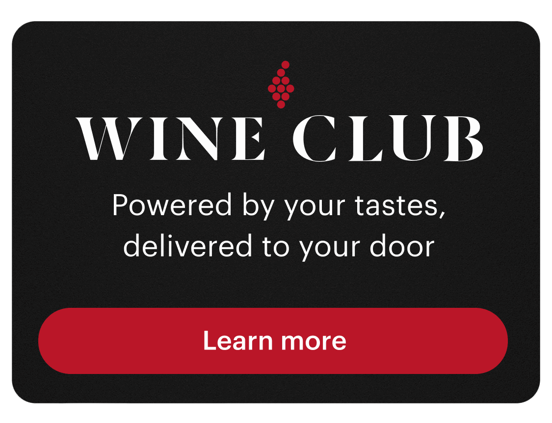
The first iteration was barely seen and it was mistaken for a banner.
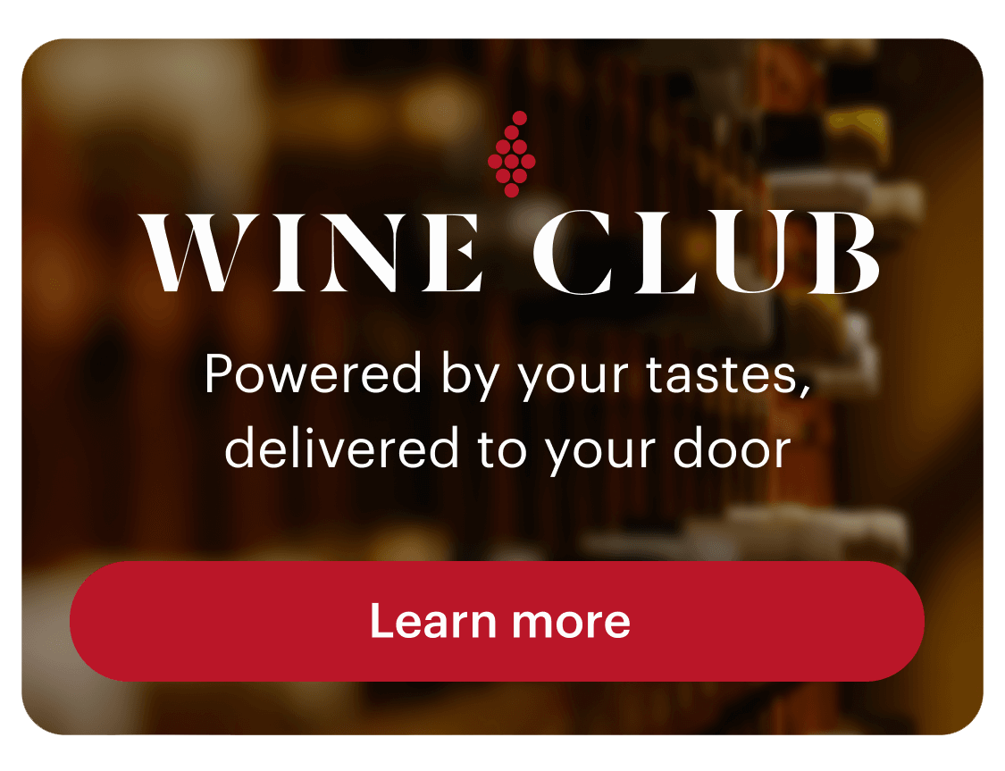
The second version had a video playing the background.
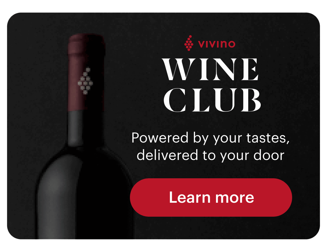
Last version tried to show a bottle making it even more confusing to users.
Vivino is a colorful brand, with a handful of different color badges, icons, and buttons. For the WineClub message to stand out, we opt out to strip down part of the colors and try a more sober direction.
Editorial concept
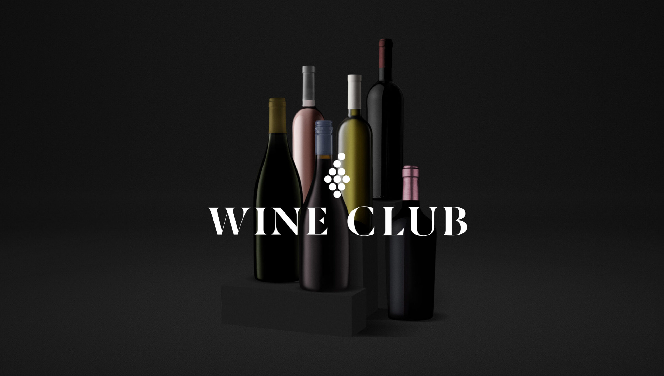
The first version would borrow from the editorial world where would photograph 6 bottles of wine, in different shapes and colors to represent what you get with the wine subscription.
Prototype structure
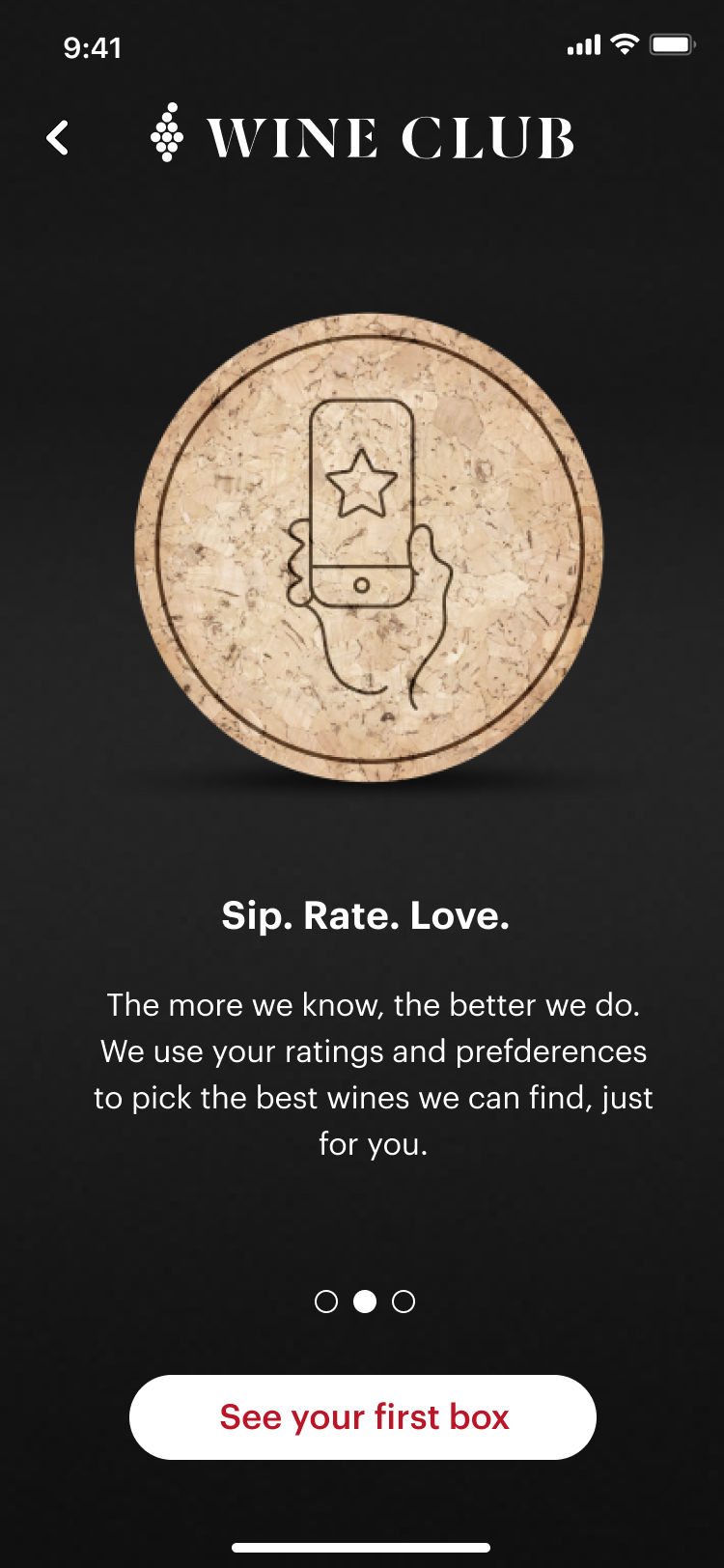
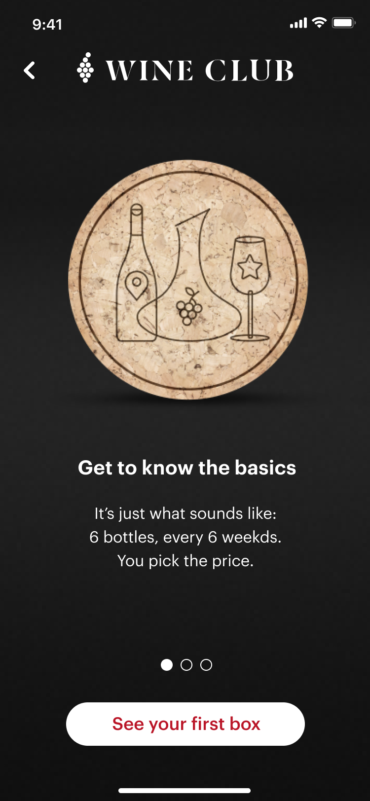
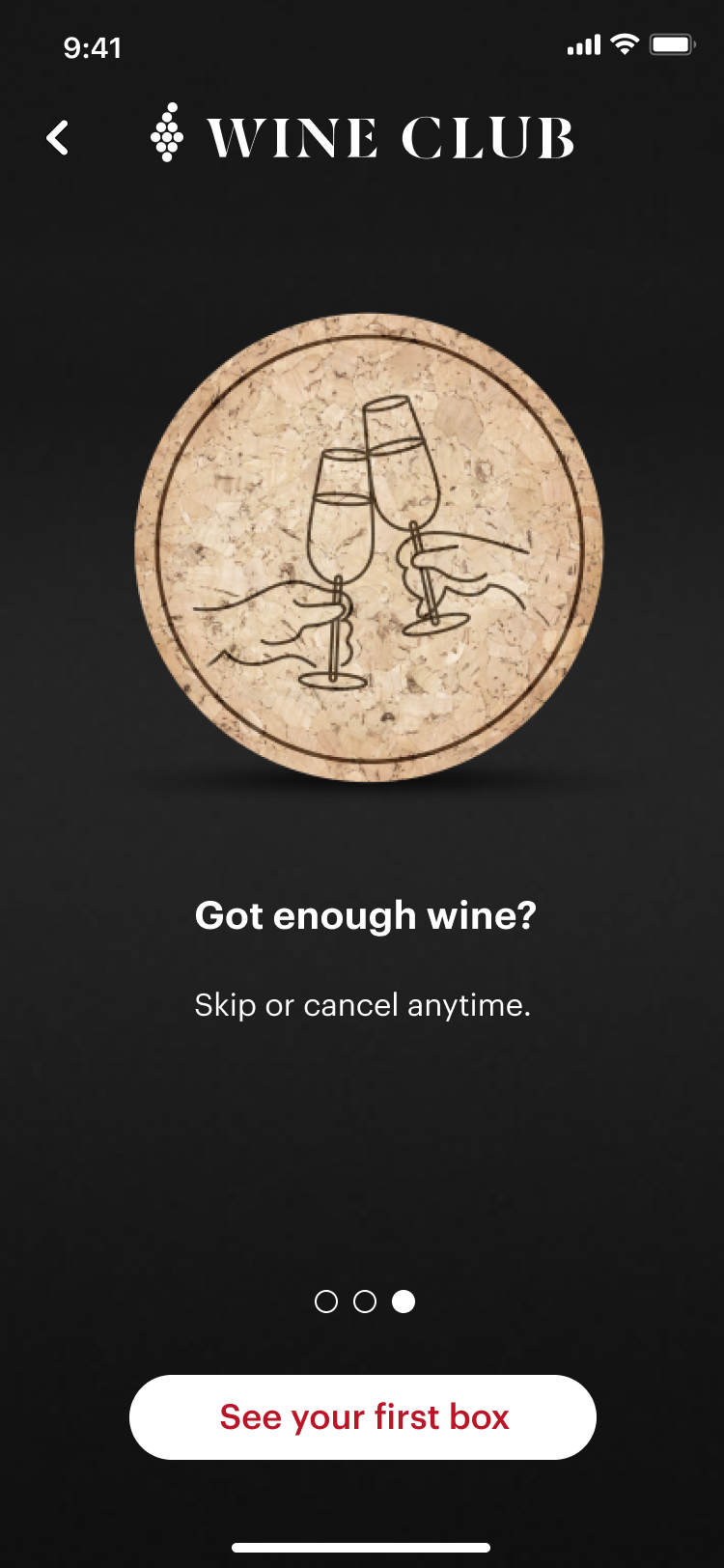
When clicking on the WineClub Card in the personalized section of the app entitled Picked for You you would land on the screens below.
The goal of this test was to see if the copy was compelling and if the message was perceived.
High Fidelity Prototype
Mysterious concept
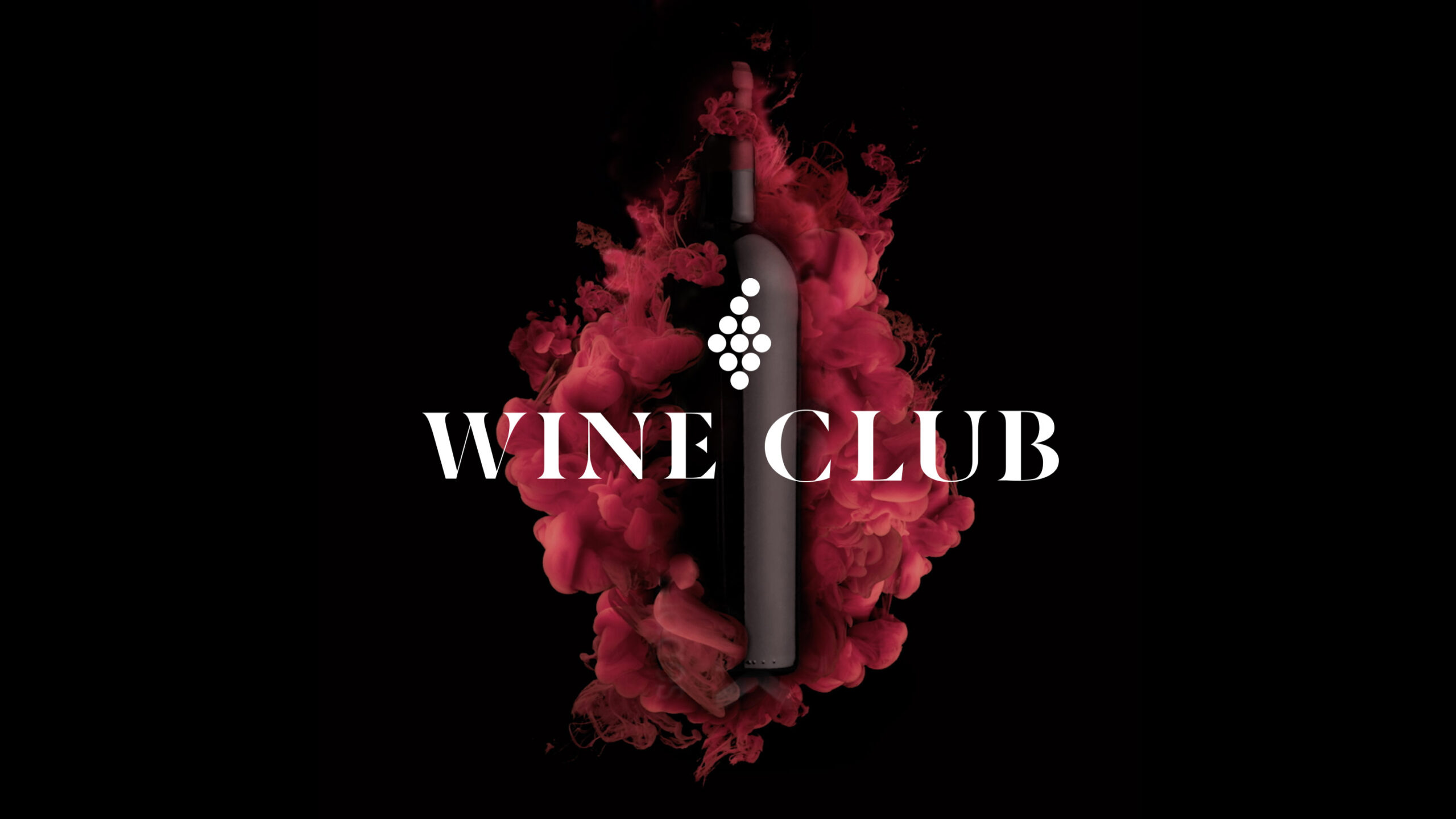
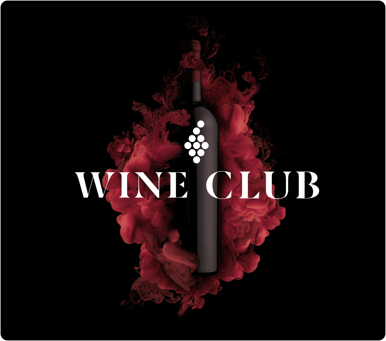
In the second version, we wanted to create a more mysterious and refined visual that could explore the beauty and the texture of wine innovatively.
Prototype structure
When clicking on the WineClub Card in the personalized section of the app entitled Picked for You you would land on the main USPs carousel and would navigate vertically (swiping or clicking in the white arrow).
The goal of the test was to see if the copy was compelling and if the vertical navigation would work.
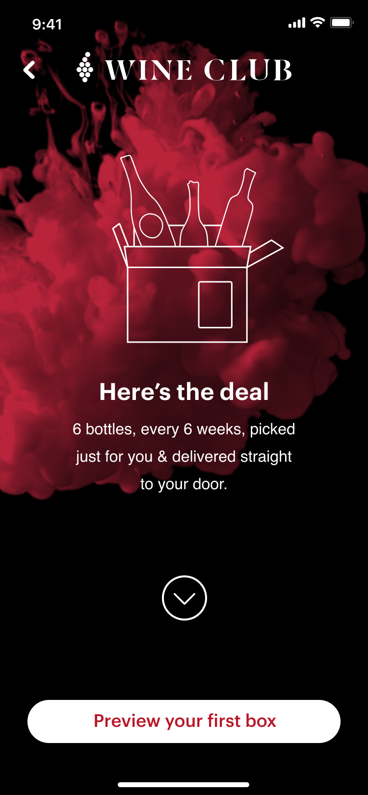
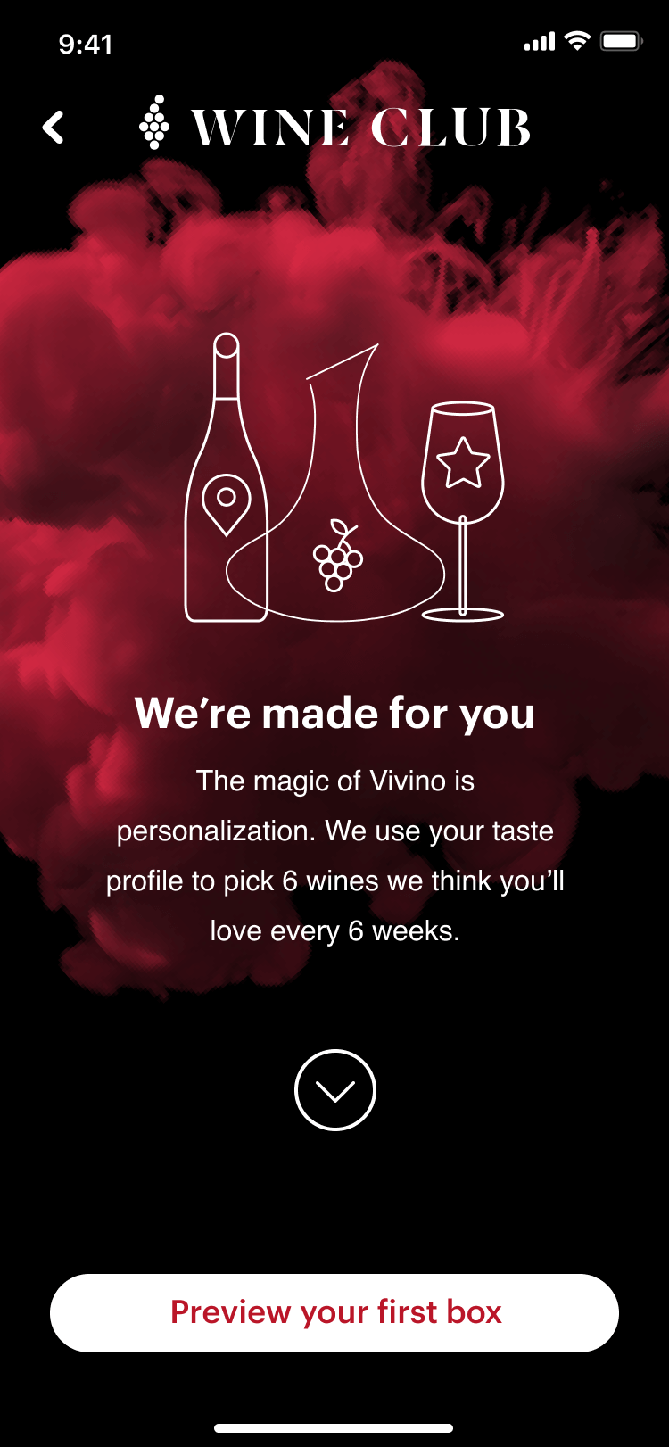
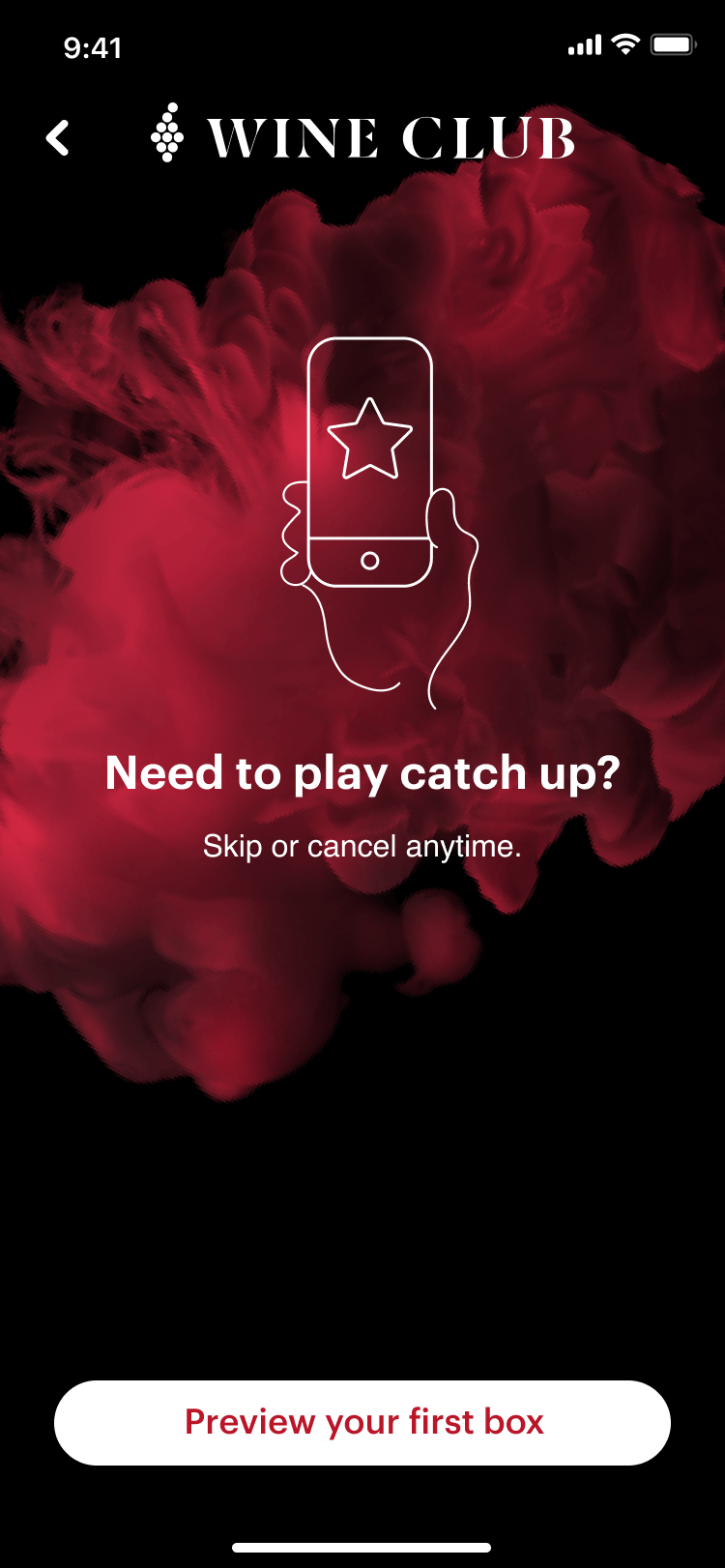
High Fidelity Prototype
Results
Out of 5 out 6 preferred the mysterious visuals and 1 out of 6 could understand the vertical navigation of the second prototype.
The mysterious direction gained a lot of traction inside but the production cost to materialize the vision was too high for the budget allocated of this initiative.
Let's connect
© danielsimon.dk • Made with Semplice