Product Design Lead
YOUSEE (TDC Group)

RESPONSABILITIES
I've led YouSee's Digital Design for 2,5 years and helped redefine the brand's digital identity across its multiple channels.
WHAT IS YOUSEE?
YouSee is the largest internet and phone provider in Denmark and part of Nuuday, a subsidiary of TDC Group, the largest telecom in the country with 1,4 million customers.
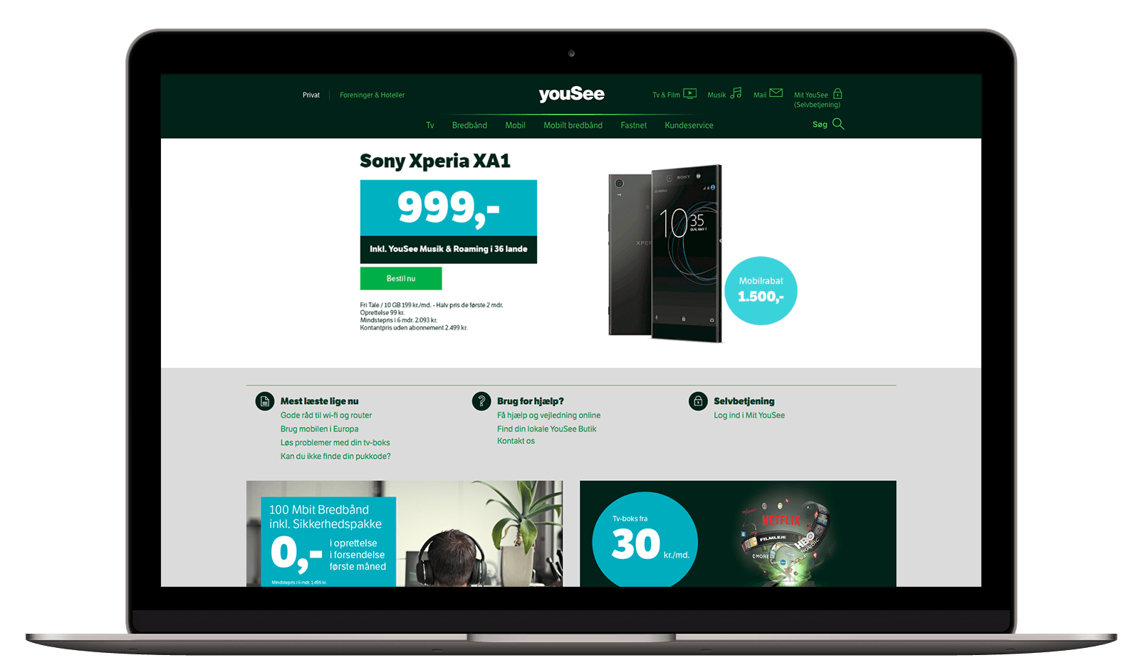
Before & After
Goals
• Become the Nordic's most accessible brand
• Improve User Experience
• Increase sales online
• Reduce calls
Create YouSee's brand new digital experience revamping the brand’s user experience and expression online.

UX & UI designers at a Design Audit Workshop at YouSee.
The process
We knew that changing one of Denmark’s biggest players with a customer base of 1,6 million users it wouldn't be easy and it would take time.
The project had to be broken into three main implementation phases: a long term design vision, kickstart the design implementation and create a design system built to scale.
1. A Vision
Create a vision for the new YouSee's digital brand expression.
2. User Experience
Improve user experience at the main pages and start establishing a design coherence.
3. A Design System
Create and implement a Design System to speed up migration to the new design and build a framework for scaling up.
1. The Vision
2. User Experience

Welcome experience
Create a personalized homepage focusing on a much more visual experience.a

Explorative experience
Remove the clutter and excess of information to help users reach out to what they are looking for easily.

Content experience
Highlight Yousee's premium content switching the background color to give it more space to shine.
2.1 The Navigation
Our first task was to fix the navigation and dramatically improve customers' user experience making it easy for them to find what they were looking for.

Customer feedback
“Svær at finde rundt i”
(Difficult to find your way around)
Survey response, November 26th, 2017
“Jeg kan ikke finde rundt i menuerne..."
(I can't find my way into the menu...)
Survey response, November 23rd, 2017
Navigation issues
1. Mobile and Desktop menus were full of ambiguous labels.

2. On the mobile view, there were multiple menus pretending to be the same.

3. Patches added later to redirect customers in search of help.

Fixing the navigation
We started with competitive research and a complete new Information Architecture.


Prototyping & User Testing


New Navigation
After spending some time refining all the findings from the User Test, we started designing. Icons were redesigned and a look & feel started emerging.
We ended up with a much simple navigation user interface, with only two main menu points. We also included fast shortcuts for our most accessed services. For example, 30% of our traffic was people looking for their webmail.
In motion
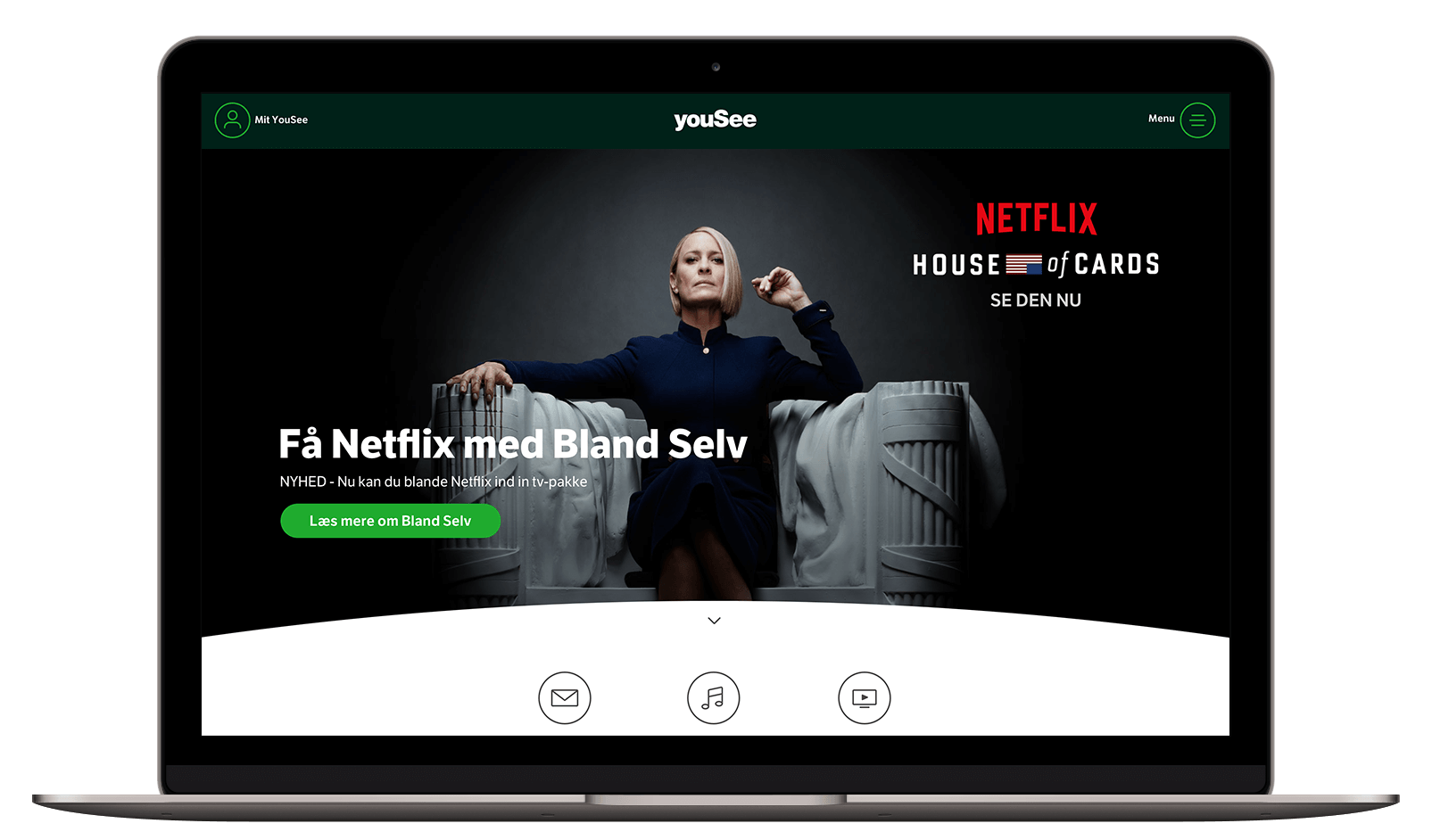
2.2 Frontpage
After fixing global elements like the navigation and the main search function, it was time to start implementing our vision on the frontpage.
Product Storytelling
The goal with the New Frontpage was to create a hook on each product highlighting their UPSs.
Using Simon's Sinek* Golden Circle logic we wanted to start with the why of the company, followed by how and what. That logic displayed partially by the wireframe down below would be reflected in each one of the main products.

We start the design with the first 3 modules to get the stakeholders an idea of what the look & feel of this page would look like. The video illustrating the first modules can be seen down below.
First modules concept
After the concept had the buy-in from the stakeholders, we had to break the implementation in phases. We decided to start the first phase with a commercial/marketing approach MVP. The result you can see it down below.
The MVP
Results
Become Nordic's most accessible brand
20% increase in accessibility
Improve User Experience
10% more qualified clicks
Increase sales in the online channel
Redesign mobile flow increased sales 3x per day

3. Design System
After we were done with the design vision, the whole website needed to be updated but several squads were not prioritizing that. The only way to speed up the process was to create a design system.
2025 © danielsimon.dk